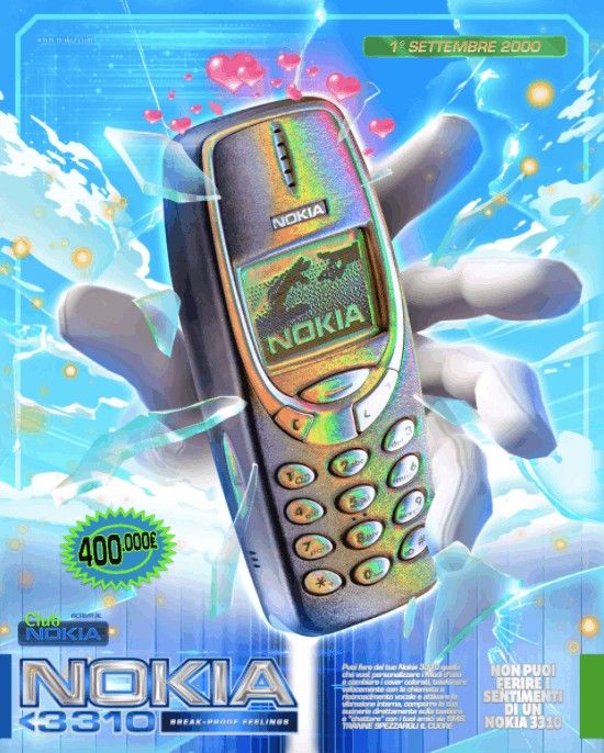
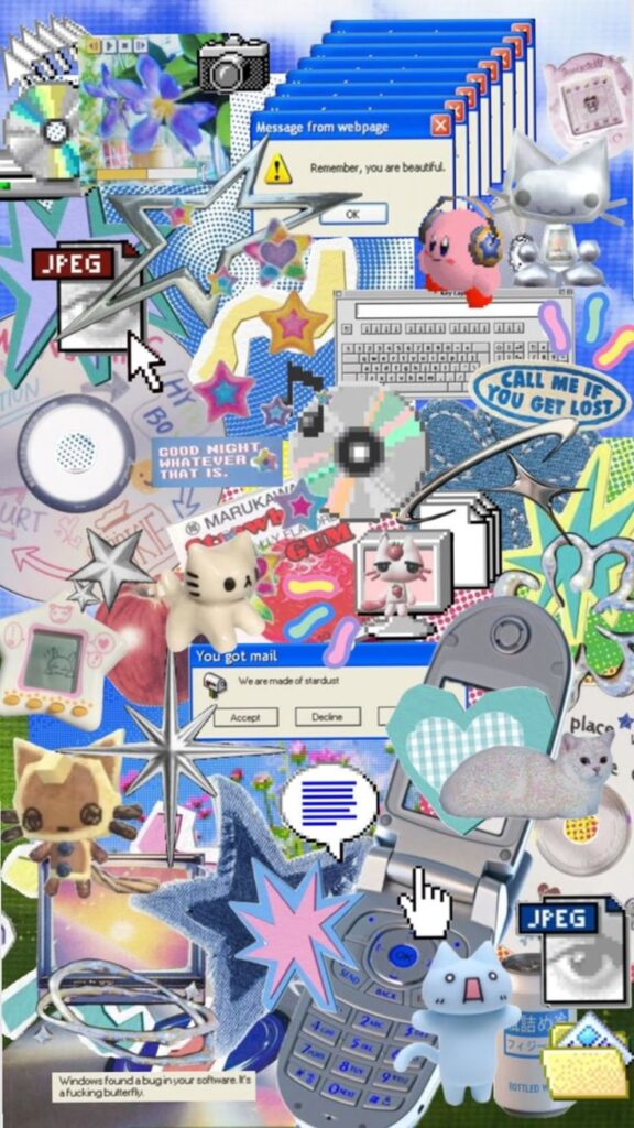
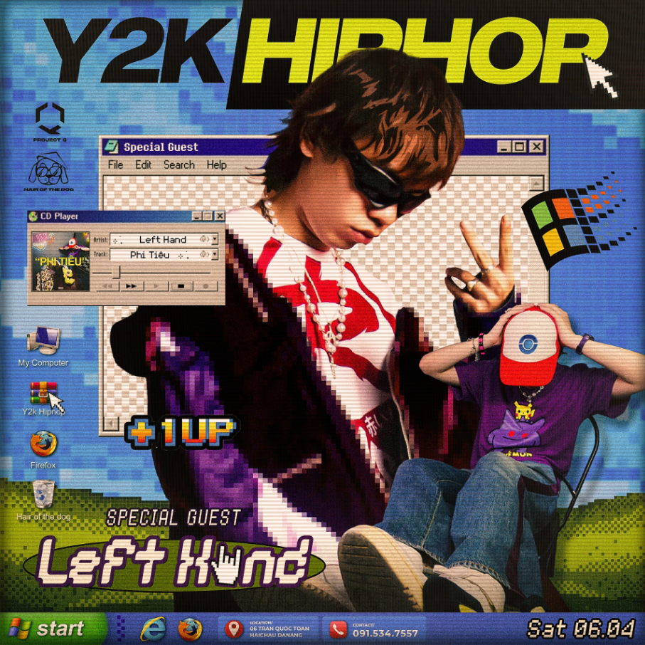
The early internet had a distinct visual language characterized by pixel fonts, sparkly text, simple gradients, and layouts that felt slightly chaotic yet full of personality. For years, designers steered away from this style in favour of minimalism. However, the early web aesthetic is making a comeback, evident in branding, album art, social media graphics, and even user interface design.
This revival is driven by a shift in what people desire from digital spaces. After a decade of clean, flat, and hyper-polished design, audiences are now craving something more expressive and human. The early internet aesthetic provides exactly that. Designers are drawing inspiration from old web textures, low-resolution icons, and the imperfections of early digital tools, creating visuals that feel both nostalgic and fresh.
You can see this trend in the resurgence of pixel-style typography and sticker-like graphics that mimic old chat windows, pop-ups, and desktop screens. Brands are reintroducing gradients, but in a softer and more intentional way, less akin to “Windows XP wallpaper” and more like “retro-inspired glow.” Even the messy, collage-style layouts of early fan sites are returning, but with cleaner spacing and better hierarchy.
This aesthetic works because it feels approachable. The early internet was a space filled with experimentation, mistakes, and personality. It wasn’t perfect, which is exactly what people miss. Today’s iteration retains that charm while minimizing clutter, creating a balance between retro personality and modern clarity.
The result is a design style that feels warm, nostalgic, and full of personality, proving that digital spaces can feel modern without being overly polished or sterile.